The Allure of Neutrals: Why Choose a Neutral Color Palette?
Neutral color palettes, often overlooked in favor of vibrant hues, offer a surprising depth and versatility that can transform any space. Composed primarily of colors like beige, gray, white, black, and variations thereof, these palettes provide a timeless elegance and a blank canvas for personal expression. Their understated nature allows other elements – textures, patterns, and accent colors – to truly shine. This comprehensive guide delves into the world of neutral color palettes, exploring their benefits, applications, and how to master them in your own design projects.
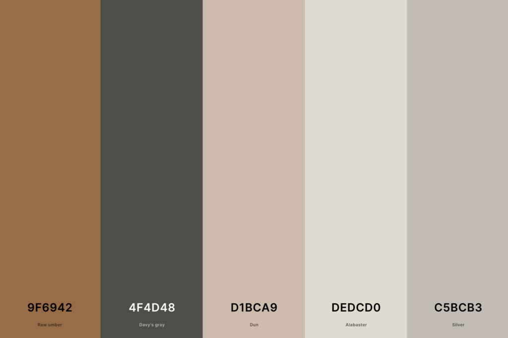
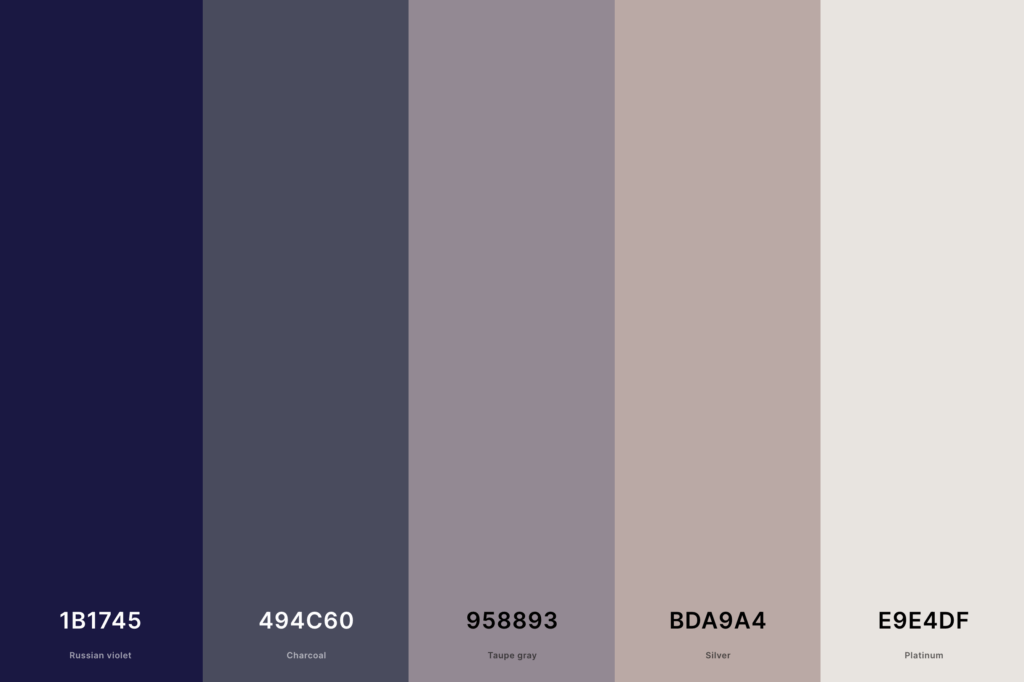
Understanding the Foundation: Core Neutral Colors
The foundation of any successful neutral palette lies in understanding the core colors and their nuances. Let’s explore each:
White: The Versatile Canvas
White isn’t just a color; it’s the absence of color, creating a sense of spaciousness, cleanliness, and serenity. Various shades exist, from crisp, bright white to creamy off-whites like eggshell or ivory. Consider the undertones – some whites lean warmer (yellowish) while others are cooler (bluish) – to ensure they complement your lighting and other design elements.

Black: The Sophisticated Statement
Black, the opposite of white, adds a dramatic and sophisticated touch. It’s a powerful color that commands attention and can ground a design. Similar to white, different shades of black exist, ranging from deep charcoal to a softer, almost gray-black. Careful consideration of lighting is crucial when using black, as it can absorb light and create a dark atmosphere if not used judiciously.
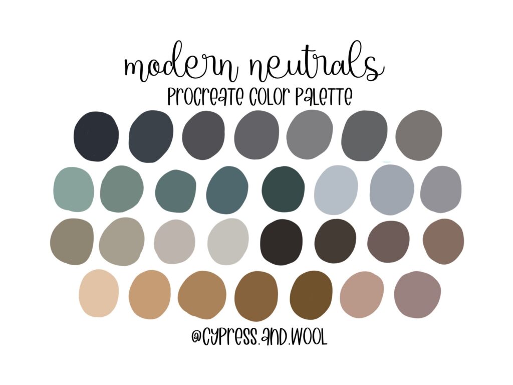
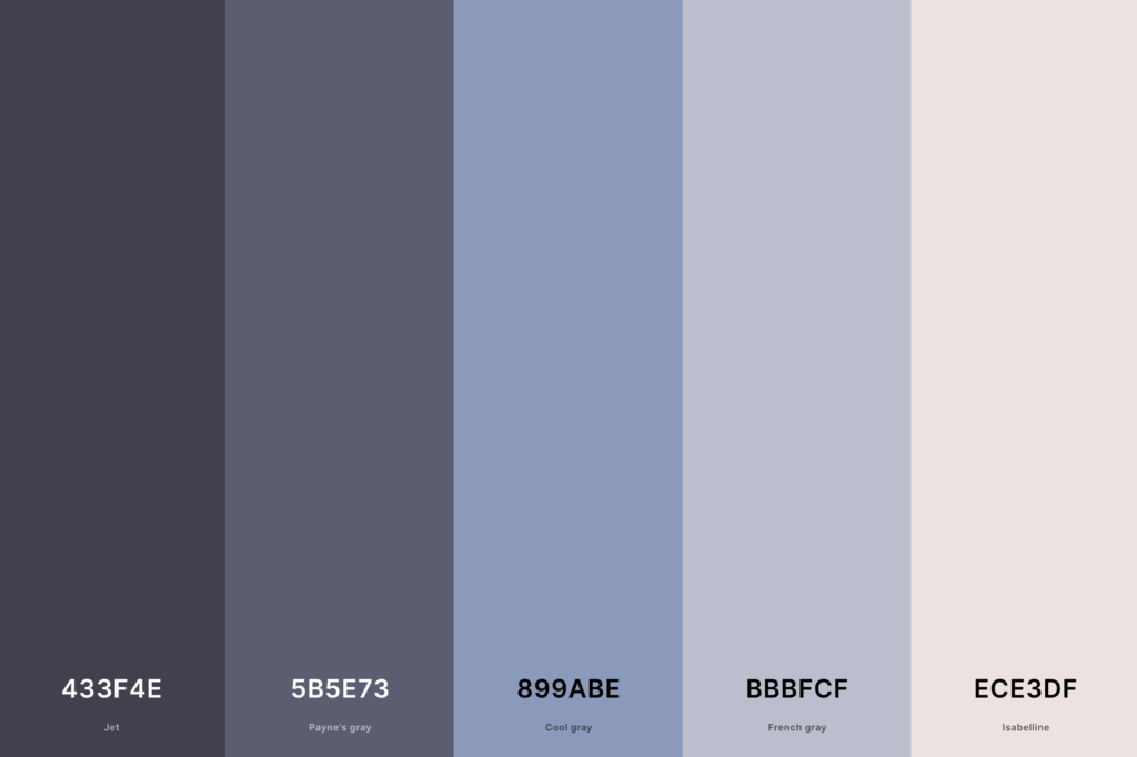
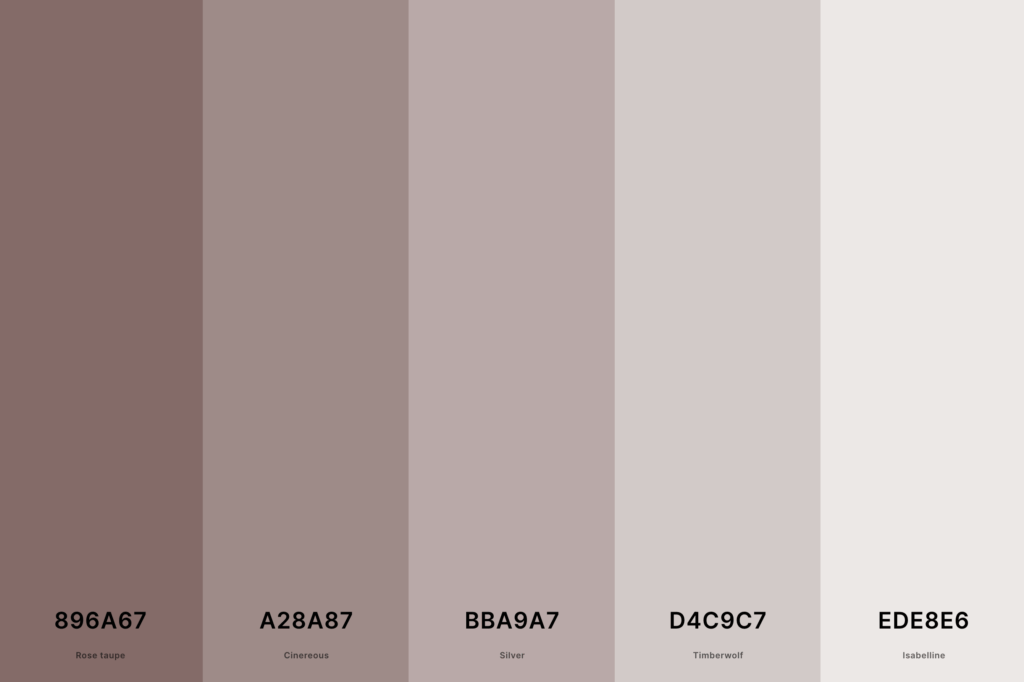
Gray: The Chameleon of Neutrals
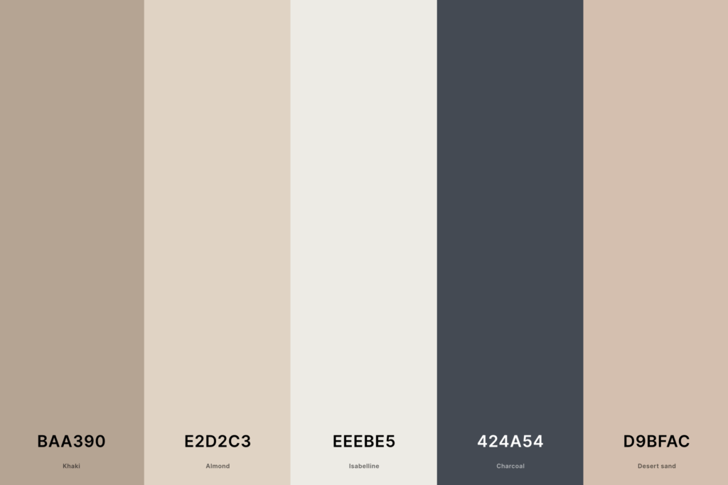
Gray is arguably the most versatile neutral color. Its range extends from light, almost white grays to deep, almost black grays. These shades offer incredible flexibility, blending seamlessly with other neutrals and providing a perfect backdrop for bolder accent colors. Warm grays contain beige or brown undertones, while cool grays have blue or green undertones.

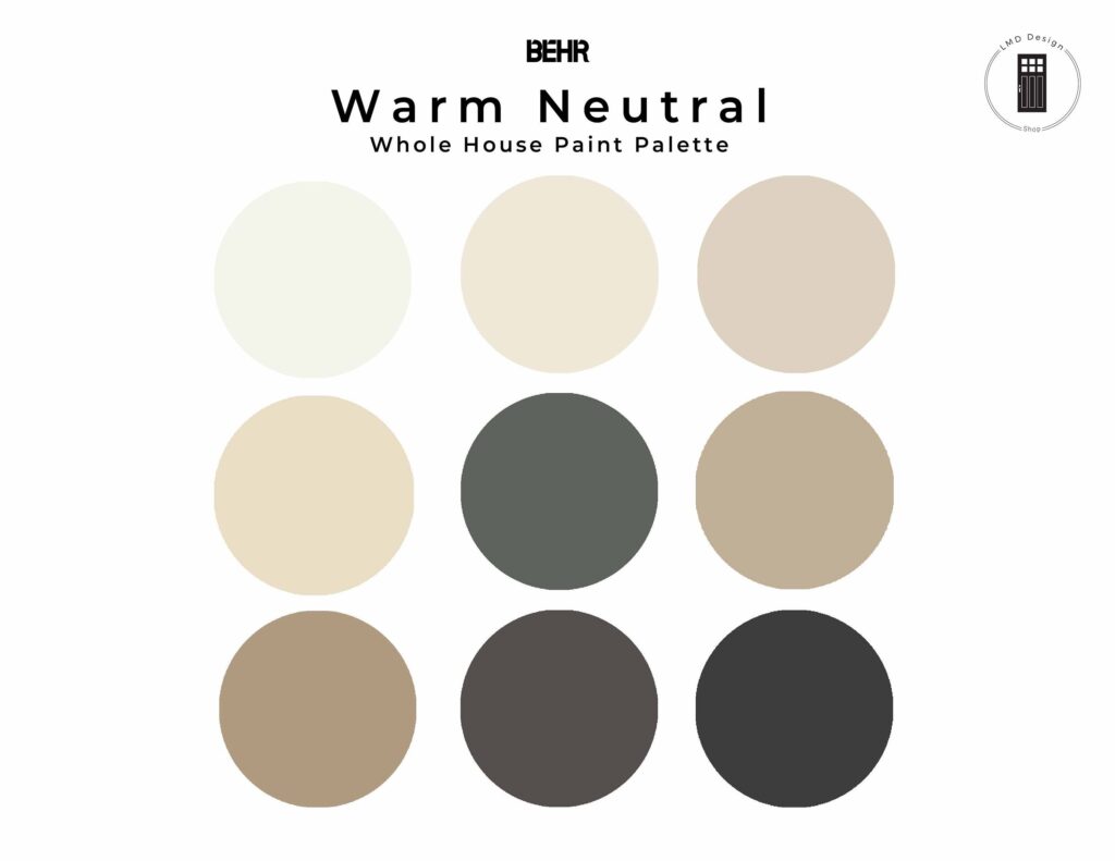
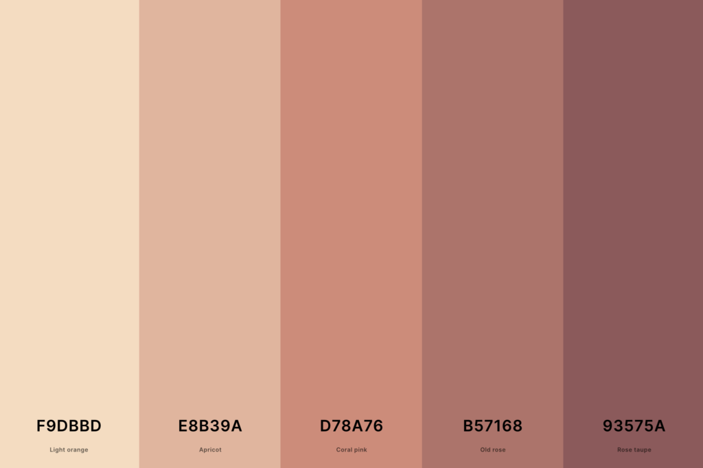
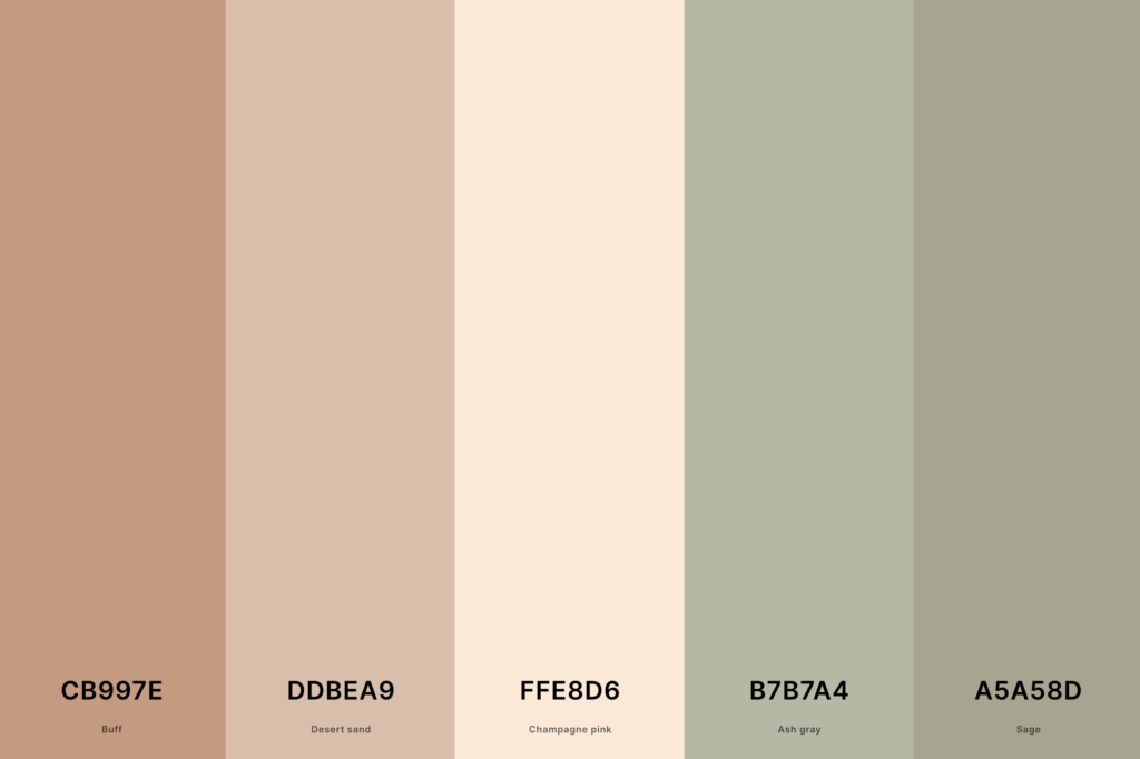
Beige: The Warm Embrace
Beige, a light brown with yellowish or grayish undertones, exudes warmth and comfort. It’s reminiscent of natural elements like sand and stone, creating a relaxing and inviting atmosphere. Different beige shades, from creamy to taupe, offer a soft and understated elegance.

Brown: The Earthy Grounding
Brown, in its various shades from light tan to dark chocolate, brings a grounding and natural feel to a space. It evokes a sense of stability and warmth, complementing materials like wood and stone beautifully. Consider using different tones of brown to create depth and visual interest.
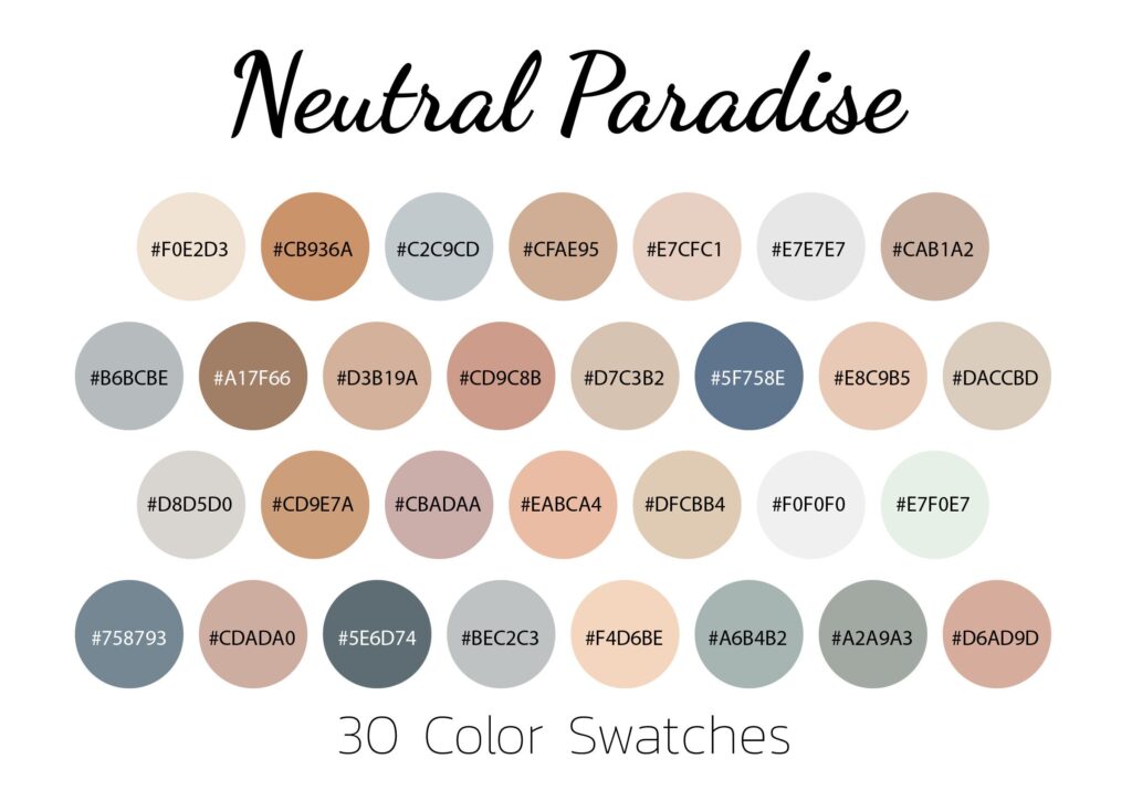
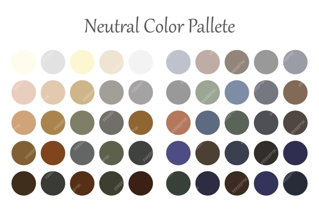
Building Your Palette: Combining Neutrals for Impact
The true power of neutral palettes lies in their ability to be combined in countless ways. Here are some strategies for building harmonious and visually appealing combinations:
Monochromatic Neutrals: Subtle Elegance
A monochromatic palette uses different shades and tints of a single neutral color. For example, a palette of varying shades of gray can create a sophisticated and understated look. This approach allows for a sense of calm and unity.
Complementary Neutrals: Balanced Contrast
Pairing contrasting neutrals, such as black and white or light gray and beige, creates a balanced and visually interesting palette. This contrast can add dynamism while still maintaining a sense of calm.

Analogous Neutrals: Harmonious Flow
Analogous neutrals are colors that sit next to each other on the color wheel, like light beige and gray. This creates a harmonious and flowing feel, offering a sense of seamless transition between colors.
Adding Accents: Injecting Personality
While neutrals form the foundation, adding accent colors is crucial for injecting personality and visual interest. Consider a vibrant jewel tone, a soft pastel, or even a bold metallic to complement your chosen neutrals. Use these accent colors sparingly to avoid overpowering the calming effect of the neutrals.

Neutral Palettes in Different Design Styles
Neutral palettes are incredibly adaptable, fitting seamlessly into various design styles:
Minimalist Design
Neutral palettes are the cornerstone of minimalist design. The focus is on clean lines, simplicity, and functionality, making neutrals the ideal backdrop.
Scandinavian Design
Scandinavian design embraces light, airy spaces with a focus on functionality and natural elements. Off-whites, light grays, and natural beige tones are common in this style.
Modern Farmhouse Design
Modern farmhouse blends rustic charm with modern minimalism. A neutral palette provides the perfect foundation, with warm beiges and grays complemented by natural wood and textures.
Industrial Design
Industrial design uses raw materials and a focus on functionality. Grays, blacks, and browns are common in this style, adding a gritty and urban feel.
Tips for Mastering Neutral Color Palettes
- Consider the lighting in your space. Cool-toned neutrals work best in spaces with warm lighting, and vice-versa.
- Don’t be afraid to experiment with different textures and patterns to add visual interest.
- Use accent colors strategically to highlight key elements and add personality.
- Start with a mood board to visualize your palette before committing to paint or materials.
- Consult with a professional designer if you need help creating a balanced and harmonious palette.
Conclusion: Embracing the Timeless Appeal
Neutral color palettes offer a timeless elegance and incredible versatility. By understanding the core colors, their combinations, and their application in various design styles, you can unlock the potential of these understated hues to create spaces that are both beautiful and functional. Embrace the simplicity, embrace the sophistication, embrace the neutral palette.